
Dominikus Baur: Web-based data visualization on mobile devices

Web technologies have become the default way to develop data visualizations: they are easy to use, convenient to debug and work across all kinds of devices. And thanks to ever-faster smartphones even they have become a valid platform for web-based visualizations - but creating something decent for them requires a whole new set of skills.
In this talk, I will present a quick run-through of all the relevant aspects of mobile web-based datavis:
- What graphics technology (Canvas, SVG, WebGL) to choose?
- How to include all the neat HTML5-supported sensors to do cool stuff (GPS, device orientation)?
- What amazing things can be done with multi-touch input?
- What changes for information and chart design?
- How to best debug mobile visualizations?
- » Munich, Germany
- » Website
- » Github
Transcript
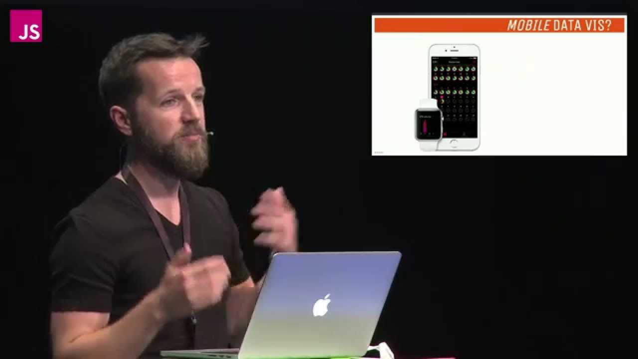
Hello JSConf! How are you?! Yes. Thank you. I'm Dominikus Baur and as you might of noticed I suffer from an all too common problem in the tech world, which is yet another bearded dude. And, here's my totally scientific analysis of the JSConf speake speaker profile pictures on the web site. As you can see, I'm not alone, there are so many of us, we should probably form a support group or something or just shave those damn things off, I don't know. So, any ways what does this bearded guy do? I'm based in Munich, Germany and I work as a data visualization freelancer, here are some of the projects that I did in the recent time I had a bat better life index for OECD, I did sell if I city, which is an analysis of the Selfie phenomenon, and also visits here which is the visualization for personal travels. And you can find them all on my web site, so check them out. They're of course web‑based. All right, so let's start, I guess most of you know data visualization, otherwise you wouldn't be here. The basic idea is to turn complex data sets into visually representations and if they're done right then you can easily spot patterns and understand the underlying data. And, this year, for example, is a pretty famous and old one, and it depicts Napoleons march to Moscow. In this graphic you can see the course that the army took, you can see it's shrinking size, so people are dying there. And you can also see the temperature down at the bottom which might give you a clue why the army was shrinking. So you have lots and lots of information in an easily digestible format you can argue that it's somewhat beautiful. So, that makes data V I S for p perfect tool for portable devices think of all the data you're producing or have to work with while on the go, and visualizations spares you from working with the raw numbers and gives you a quick overview to find out what's important. And with displays becoming even smaller now, maybe even watch sized, it can quickly show you what's relevant or interesting to you without forcing you to look at a spread sheet. Okay, so how do we go about building these things? Of course, there's the native approach, but, as you all know that's a real pain to do it like that, so you have to support IOS of coursing you also have to support Andriod and they're completely different, once you actually visit the zoo and try to do something for windows phone or Blackberry or whatever they are all called, you're in a complete mess and porting code isn't easily possible. So what better way to solve this problem than going to the web. So, the web has come so far in the past years that it's viable to develop full blown applications even for mobile devices, especially news organizations are very keen to create visualizations and attractive visualizations that work across devices, of course, so here's a couple of examples from the New York times who are doing an amazing job out there, but there are other teams like the Guardian Washington Post and so on that are also creating really cool stuff. Okay, so, what I'll try today is I'll try to give you a quick crash course of developing data visualizations for mobile devices in 20 minutes or less. First, I'll give you a quick overview, I'll talk a little bit about responsive web design and how that already gets us halfway to our target, I would say. But, it's also interesting to pursue mobile first approach to focus on the strengths that you actually get from having a portable device, that's also touch controlled, which lets you do much more interesting stuff. And finally, of course, the big issue, I would say in this whole topic is interray action, so how do you best support an interaction on those tiny portable screens. If you need more inspirations for this topic, here's two web sites that can give you that, so mobileV.is and the other one is mobileinfov Uzi.com, and both just collections of mobile visualizations, you can look at those, they're ever growing and there's really great stuff there. Okay. Of what are the main differences between desktop and mobile? So first, the obvious one, interaction happens via touch instead of a mouse, so, we no longer have this one single minuscule cursor, but we have potentially multiple fingers that are overlapping everything on your screen and just creating a mess, and we have very specific results of that, for example, we're losing hovering, we're getting something else like hovering, I'll talk about that in a minute. There's really a huge difference between that, and then, second of course, we have different screen sizes and formats, so with a laptop, or a desktop, we usually have relatively low Res, large screens, 16 by 10 or 16 by 9 aspect ratio in landscape and on mobile devises you have your high resolution, very, very small portrait oriented screens. And, this of course changes how you go about information layout, density, things like that. All right, if you want to develop data Vis for the web, I remember mend one library that you might have heard about today, already ‑‑ I'll recommend one library you might have heard about today already, we had this fantastic talk before where we saw there's a huge, another zoo out there with all of those various types of charting libraries that let you do crazy things. All in different ways, but really, D3 is kind of the lowest common denominator, so people that are doing data V I S know of it. So who here has heard of it? Who has used it? Cool. So, it really is pretty common. It's mostly being developed by one guy, Mike post dock working at the New York times, I'm not sure if that gives them an unfair advantage, yeah, who knows, Mike is doing an amazing job, he's producing lots and lots of example for 3 D if you go to BL.ocks.org, you can find hundreds and hundreds of things with really really amazing stuff in there, D3 has a very, very active community, and still being developed and hasn't been abandoned two years ago or something like that. What's really great about those examples here, usually they work directly on mobile, so if you open up this page on your smartphone, for example and try one of these, it usually just works because the interaction issue isn't one for D3, so if you want to go from mouse to touch, usually you only have to change your vent handlers a bit, so usually on a desktop you would write something like that, on mouse down, do something. And for touch, those events, those vent names change to touch star, touch move, touch end instead of the mouse equivalents, of course, those events can appear multiple times because you have multiple fingers, then you can keep track of those fingers and do pinching and stuff. The nice thing is that most of the three automatically does that, so you have certain behaviors that automatically support pinching for example so interaction really spent an issue, what's anker shoe is screen size. 3 D leaves all the scaling to the developer, pretty much. And that means, of course, that your visualization then becomes really tiny on a small screen, so those are screen shots from Bl.ocks.org, as they would appear on your smartphone, imagine that thing a little bit smaller, and especially with like, the tree map on the right here, you can really read anything or do anything with it. So scaling is an issue. And, of course, what codew we do when we want to have our web sites scale, right? We go to responsive web design, which is fantastic, so basically, you want to have a page that adjusts to the size of your view port, and, we can apply those same principles that we get in responsive web design to visualizations, of course, so you grab your favorite responsive web design framework like foundation or bootstrap or whatever, then your chart just becomes one of those boxes in your grid, and you give it a fixed width and then it's just based on the device's screen size so that's really useful I'll show you an example from my own work where we use that. So the OCED willing been project was something that I did with Moritz Stefaner, you might know OECD, it's a big organization that collects data on well‑being and how people feel worldwide. And this project here regional well being focuses on certain regions on the globe so you can check out how well people are doing in certain aspects so we have things like safety, the job market, education and so on. And they asked us to create a visualization that lets people easily explore this data, our idea is to focus on a certain region and then let people explore from there, and what better region for that than the one where people actually level at the moment, so this page starts with your home region, then you get this nice visualization that shows the various aspects of well being. You get a list of similar regions to your own which sometimes is very surprising, and then down at the bottom of the page you get an overview of those of quality factors and details so you can compare, for example, safety to other regions in your country and so on. Okay, so you can just Bruce that, you can just jump from region to region, adds we didn't have the budget to create three different web sites for three different form factors we made the whole thing responsive, and if you're trying it on your tablet or your smartphone even you might see that it should just work. And hear's kind of the underlying magic so all of those pink boxes are our grid elements in bootstrap, and, yeah, by just putting those visualizations into those boxes you actually get the whole responsiveness for free. And, depending on your screen size, of course, the layout changes some elements become bigger on smartphones for example, and as you can see, like those three detail views in a row become two and then one on a smartphone, so it actually works pretty well. But, of course, that's not everything, there are those little details that you learn on the go, on the job. And I'll talk about those a bit. So one thing is drawing a visualization is usually quite heavy on the CPU and the battery and so on. And you don't want to dill your browser tab just because you decide that you want to redraw your visualization every time the user adjusts the window size by one fix el. So that's when something like debounce for example or throttle comes in really handy, I usually use the underscore version, but there are, of course other implementations out there. The basic ideas behind those debouncers is that you give it a function, in our case, render, and this function, is at most, called every resize, refresh, rate, if you set that to 300 milliseconds then it's only drawn every third of a second and not like hundreds of times per second. Which is quite useful and you might also see that if you actually try it on your laptop and adjust the size of the window you see that the visualization takes a bit to be redraw, but at least that keeps us from crashing the browser window, which is nice. Of all right, another thing are meta view ports, so that's something you want to set on mobile devices. It's just in the header of your HTML, and there's this meta tag called view port. And you can define certain things how mobile Safari or mobile Chrome displays your web site. You can say for example width equals the vice width the web site is initially as big as your screen, from the width. And you also want to set the initial scale to one, so it's zoomed to one hundred percent. Sometimes it might be useful to say something like user scalable equals no, which means that people can't enlarge your page by pinching. Depends on the application if you want to did that. One last thing when you come to responsive visualizations are SVGU view port, most are build in SVG, I guess all the 3 D examples use SVG, usually. And what's nice about SVG is that as the names scalable vector graphics implies, it's actually a vector graphic so it can easily be scaled and you can control that using CSS. So with the view box, attribute here you can define your own virtual coordinate system within the SVG, so here the coordinate system goes from zero zero to 500 by 250. And, everything that you draw within the SVG is then scaled according to this coordinate system. And what you also want to do is you want to define that the aspect ratio of your virtual coordinate system stays the same, and that's what the second attribute does, preserve aspect ratio. There's actually two parameters, the second one meet means your SVG is always scaled so that it's everything is visible and nothing is cut off. And, the first one, the XMidYMin thing, means your SVG view port should be centered on the horizontal access and should be aligned with the minimum on the Y access. So it looks like this. So if the SVG actually fits into your window, everything is fine. And here it's a bit different, here is where you actually get horizontally centered box. Which is your SVG. And, it's also kind of ary site in web development, so you get that for free if you set those attributes. Okay, but let's dive a little bit more into details, when it comes to mobile data visualization. What happens when you actually approach this whole problem from a mobile first design perspective. And see what comes up. So, first of all, usually, the person that uses your visualization on the smartphone is like this woman here. So, they're in the middle of something, they're not in the mid for any of your fancy sha Nan gans, they want the data as wick quickly as possible. So, I would say always when it comes to mobile interaction design, just going to let that loop. When it comes to mobile interaction design, think about what's the task of the person that's using your App or visualization or whatever, and try to support that as well as possible. And what's rally helpful with designing something like that is, sorry, I have to take your picture away now, guys. What's rally helpful is that you can get certain aspects of the concepts using the new HTML 5 APIs, when is Geo location, who's used that already if yes, awesome, this one's really great, it basically gives you the user's current position, global position in this little amount of code, so you just call get current position, you give it a call back and hopefully you get some latitude and longitude. So we use that as well in the regional well being project, so if you open it up on your smartphone our your browser then you get something like this pop up here that asks you if the web site is allowed to use the current location. So you can also see that it's actually much more privacy conscious than server base solutions that just do it based on your I P address without asking you. Once you set that up, you get the visualization starts on your home region or the region that you're current live at, so it should show Berlin, right now, if you tried. And that's really nice, you adopt have to pick that from a list or anything, jousted get it for free. Another aspect when developing for mobile is of course per to mans and battery drain. So, you want to have fast beautiful graphics, of course, but you also want to be careful that you're not actually draining the battery in the process, so there are a couple of graphics technologies that you might want to use, so SVG, I already mentioned that it's vector based, it's DOM integration, tie certain events to elements, but it's somewhat slower than other alternatives I would say. Faster is canvas, which just gives you a plain canvas and you can draw on that. But, kind of a down side is that it's very low level, so you actually is trough draw on your canvas, you don't just say, okay, here's a rectangle and it's going to stay there, you have to draw it every time. You also don't get a DOM, you have to figure out where the user now tapped. It's kind of the same with webGL, which is probably faster than Canvas and able to do D, which is awesome, but, again (3 D) it's low level, it has no DOM, so basically, pick your poison. By now web GM is supported inment iOS 8, so it's viable to use that. All right, when we talk about interaction on mobile devices the main problem is probably the fat finger problem, which means that you're using those things here to interact with interact with anything on your smartphone, most smartphone company recommend minimum size for on screen elements, apple says 44 by 44 fix els, but, yeah, it (Pixels) it varies, but it's always something in that range. You have to make sure all your interactive elements are big enough so people can interact with them. Sometimes you can avoid the fat finger problem all together. So in the Selfie city project that I did with Manovich, Stefner and a couple of other amazing people. We looked t a the differences in Selfie taking practices across cities worldwide. And part of the project was self exploratory that you can see here, where you can explore the data set, you have filters at the top where you can tilter the Selfie collection based on head orientations, based on glass, smiles, city and age and stuff like that. Then you get the results at bottom. And what was good for us was that everything was big enough that you could just use it on your finger so it kind of ‑‑ with your finger so it worked out of the box. But, of course, the problem is what do you do when you want to show really high resolution visualizations that are still interactive. And again there, are a couple of tricks that you can use. Probably the most common trick is invisible touch areas. So the idea here is that we have to scatter part and we want to have people being able to tap on the circles, and of course they're much too small, so we create those not very invisible here, circles, the orange ones, so mostly you just set the opacity to zero, give them a high Z index so they're on top of everything, and made osituation absolute and stuff like that, you add your touch event listener and then, of course, those s have to know which part of the data they represent. And based on that, you can then have those things be interactive without actually displaying them. But, of course, as you can see, it doesn't always work, even here in this very simple example we have this overlap between two circles, what happens more often is that you just create a full rectangle, another invisible reck tank opacity zero, put it on top of your graph and then every time you have a touch vent you try to figure out, okay, which part of the data is the finger closest too or something. And then I show the tool tip or filter or whatever. And talking about tool tips is one of the main problems when it comes to touch‑based visualizations, because as I said, we no longer have hovering really with fingers, but tool tips are really ubiquitous in visualizations, they're pretty much in everything because it's such a nice solution to display details on demand by showing a little tool tip. And, in mobile Safari for example we kind of have hovering, but it's weird and you probably already seen that, so if you tap on an element that has some mouse over event defined once, it triggers the mouse over event and then when you tap again it's a mouse down. And for most people that is just totally confusing because they tapped on something and then the tool tip pops up and they're not really sure are they able to tap again or not. So I can't really recommend that. A better solution is to have always on tool tip, always visible but tied to some type of interaction, in this example from the New York Times for example, we have two solutions, first we have a little tool tip there that's tied to the slider and you can just move that around. And you also have here this banner like thing at the bottom that's always visible and shows you information. So that's ‑‑ I would say that's probably a good solution to have something like that. Then of course you don't only have down sides you can do ahassing things with multi‑touch indigestual interactions, so one idea ‑‑ gestureal interactions, one idea is to keep it on one side and decide what to do with it. Rotation scaling. Frameworks can help you, two examples from the three, and those handle multi‑touch automatically so if you open them on your tablet for example, you can pinch to zoom this world map and you can move multiple circles around using multiple fingers, if you want to be more fancy about that, you probably want the use some gesture library like codeJ or hammer J several, those detect full gestures so you get stuff like swiping, pinching, rotating and long press and so on. So you can go totally craze crazy with that. And if you're building something with touch first in mind, then you can kind of look at your visualization as something that's deformidable, some physical object that you can play around with, that's what I try to do in this research project here. ‑‑ which isn't playing. Here we go, that's touch wave. In touch wave we had a screen graph you could just manipulate it using your fingers, as you can see you can just stretch it, enlarge it, double tap to change the layout, so we went as far with the metaphor as we thought useful. And if you really want to do that, so, that project is already two years old, so I had to implement it natively. But, by now it should probably even work on the web. Okay, here we go. All right, something 245 you can do right now is you can use, for example, the device orientation events, which is really cool, so those actually give you the orientation of the device in space we've already heard about ‑‑ talked about that yesterday, which is really neat. So you can use that for example to build one of those little demos here, you can check it out on your smartphone, you this little globe, when you orient your device in a certain way, then it spins around, which is a neat effect, you can probably do all kinds of crazy things when it comes to visualization, 3 D maybe even though that's somewhat of a four letter word in the community. Yeah, you can build that right in your browser. That's it for me, here are links to some example, on my web site as well. Talk to me on Twitter, send me an e‑mail, or talk to me later in person. Thank you. (Applause) Edit transcript via pull request.